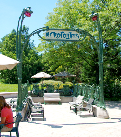
Designed around 1900 by architect Hector Guimard, this art nouveau subway design has been defining Parisian streetscapes ever since – over 80 of these elegant gateways survive. This original example now holds court in the sculpture garden at the National Gallery of Art in Washington, DC, sharing the stage with… Read more »
Category: Architectural
EGD for…well…the Environment
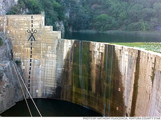
At last, Environmental Graphic Design can live up to its alternate namesake and promote environmental change. Anonymous “artists” stepped up the battle being waged to remove an obsolete and unwanted dam in the Ojai area of California by painting a vast graphic dotted line and scissors icon along the face… Read more »
Low-end Information Kiosk
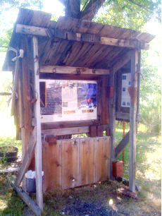
Providing many of the features of a slick big-city or national park kiosk, is this modest homemade information stand seen in rural Oregon. It has a map, destination lists, visuals and explanations of local attractions, a place to post notices – even a trash can. The humble structure embodies many… Read more »
Historic Building Marker – Shanghai-style
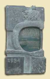
This elaborate bronze casting identifies and celebrates a historic building in Shanghai’s Jingan neighborhood. Quite a contrast with the simple rectangular markers seen on historic structures in the US.
City Musicscape
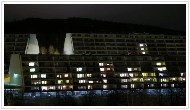
Norwegian director, André Chocron, installed a number of cameras across a small Oslo hamlet, filming the city’s architecture throughout the night until the early dawn. The video captures residents going about their lives, turning lights on and off in their apartments. What makes this video special is the post-production editing… Read more »
Messing up Modern
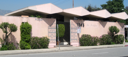
Here’s a dramatic example of Mid-century Modern commercial architecture, but the current owner just doesn’t get it. Degrading the clean lines and spirited design are tacky painted-on Italianate ‘gates.’ Nothing adds old-world charm like spray-painted wrought-iron stencils.
Designer’s Inspiration #1
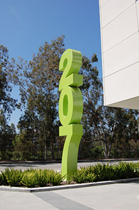
There’s a beautiful sculpture in Glendale CA, not far from Hunt Design. The simple structure is a 24-foot tall, stacked address number, in Helvetica Bold, and painted lime green. There are many address numbers that blur the line between signage and sculpture, but this one stands out because of its… Read more »
Adaptive Re-use A+
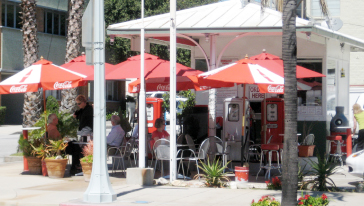
Creative and profitable re-use of underutilized commercial property is all the rage these days, but seldom do you see examples as literal and successful as this gas station-now-taco stand in Pasadena. The design is smart and minimal – just add tables and colorful umbrellas. Sitting among the gas pumps with… Read more »
Devil in the White City
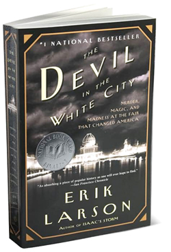
Devil in the White City: Murder, Magic, and Madness at the Fair that Changed America By Eric Larson (Crown, 2004) Combining the story of the design and construction of the seminal 1893 Chicago World Exposition with an actual murder mystery of the same era, this page-turner is a must for… Read more »
Lining Up for Art
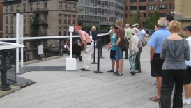
We’ll line up for almost anything, but seldom for art. Here, on New York’s High Line, artist Richard Galpin has ‘em waiting in line to look through his clever stencil-cut panel that aligns architectural features in the background with cut-out forms in the art (foreground).