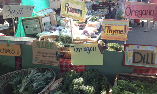
Typefaces have distinct characteristics and when used creatively they can differentiate products and even suggest personality. Here, at a sunny farmer’s market in Pasadena, California, a produce seller employs not only interesting typography, but the additional graphic design elements of borders, pattern and color to make a lively and diverse… Read more »
Category: Outdoor
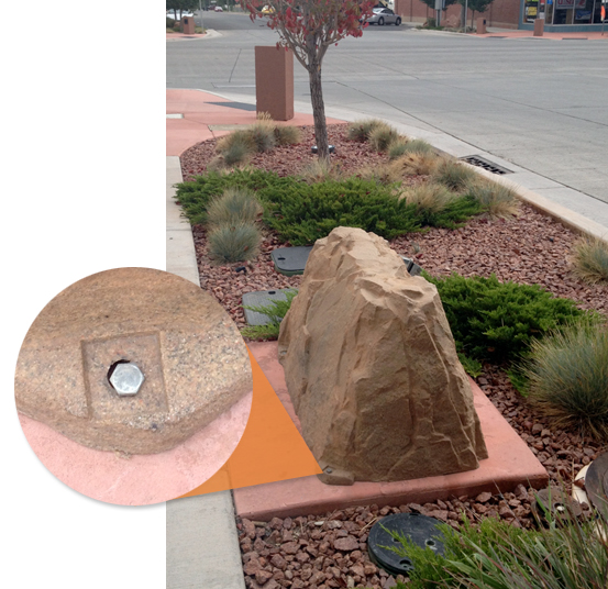
Be sure to bolt down your rocks.
Richfield, Utah streetscape
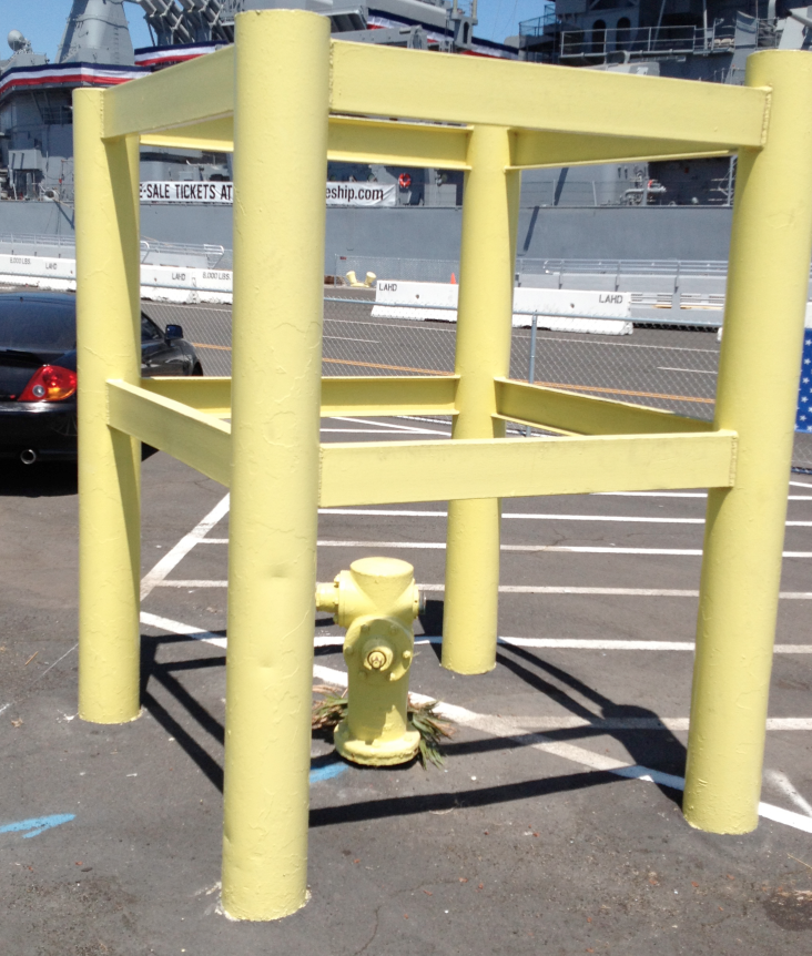
Don’t Back into the Fireplug
This two-foot fireplug is protected by a massive steel enclosure nearly nine feet tall and almost as wide. And with the freshly painted high-visibility yellow paint, we think the little fireplug is safe from attack by everything from Mitsubishis to Mack Trucks.
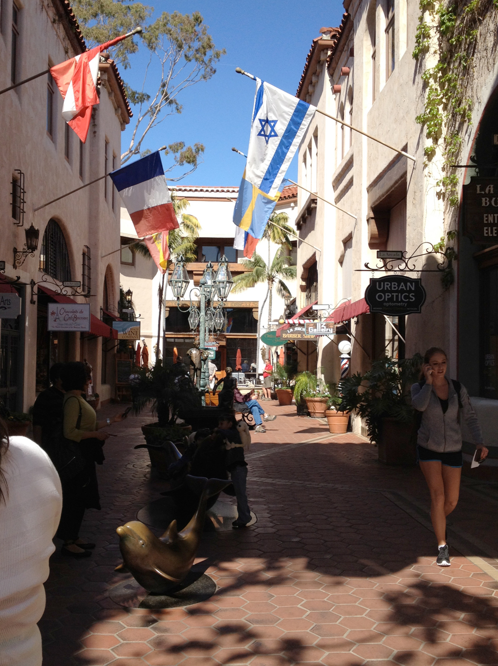
Perfect Urban Scale
One reason we like and feel comfortable in certain public spaces is scale – human scale. This attractive paseo in Santa Barbara, California is not only just the right size (width to height), but has all the design elements that gracefully scale-down the environment to people size. Colorful flags, awnings,… Read more »
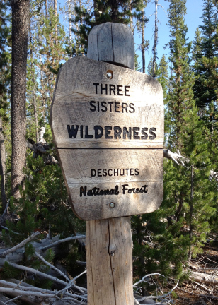
Elegant Wilderness Wayfinding
This finely crafted sign greets hikers on a trail to Oregon’s Doris Lake. The beautifully shaped oak panel has been carefully notched into the pine post. Eclectic, but appropriate typography, sand blasted and paint-filled, completes the classic design. A real pleasure to encounter on a hike.
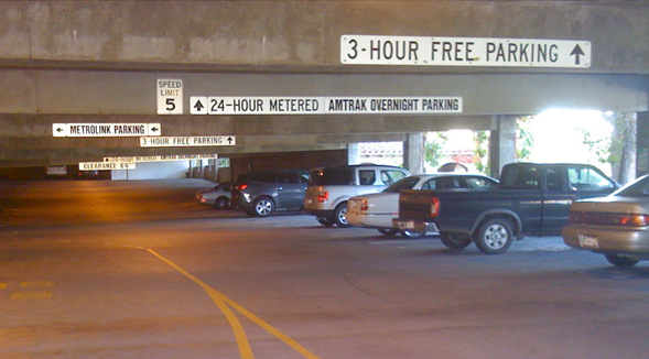
Quick. Where do I park?
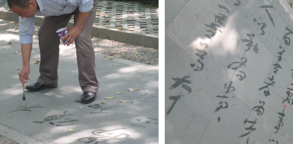
Calligraphic Street Artist
To earn a little money, artists are often seen plying their craft on the streets – think caricaturists, guitar players, even Circ de Soleil in the early days. Here, on a hot Shanghai day, an expert calligrapher using only a brush and water delights passers-by with elegant but fleeting Chinese… Read more »
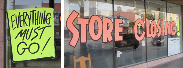
This Kind of Signage Must Go
Here’s a store that’s been going out of business for three years, degrading the Pasadena streetscape every day with tacky and quasi-legal signs.
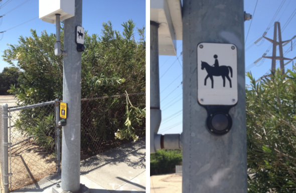
Trot/Don’t Trot
Urban Color No.2
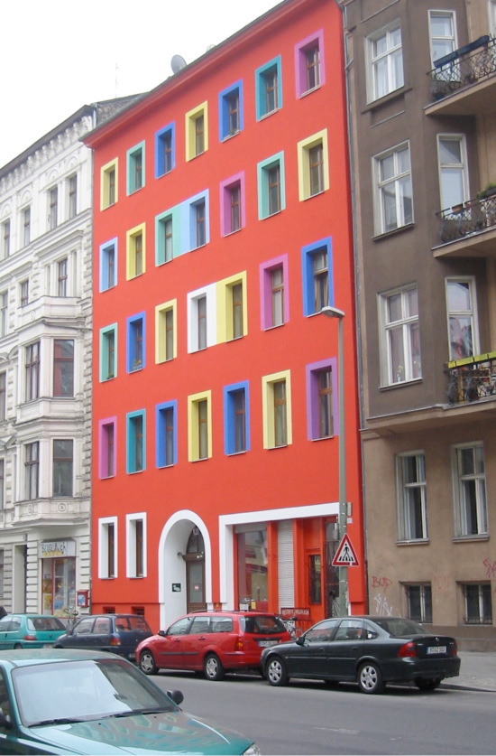
Berlin is often described as a gray or monochrome city, but sparks of color can be seen many places around this emerging European arts center. Here, a palette of cool hues on the window frames makes a striking pattern against the red background of the building. It could almost be… Read more »