Expert backpackers can spot them in the densest of woods: the blazes cut into trees by the original builders of a trail – the trailblazers. Usually a few feet off the ground to be seen above deep snow, these careful cuts into the bark are truly basic wayfinding elements. Look… Read more »
Category: Outdoor
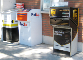
First News Racks. Now Shipping Drop Boxes.
Joining out-of-control newspaper racks on our crowded sidewalks is a new clutter source — branded shipping stations. Usually seen inside office building lobbies, these ungainly and messy-looking drop boxes are popping up in the public way. More unregulated commercial mess on our streets. And, are Fedex, et al paying lease… Read more »
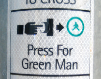
But, what if I want a blue man, or even a purple one?
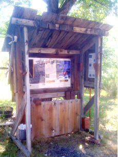
Low-end Information Kiosk
Providing many of the features of a slick big-city or national park kiosk, is this modest homemade information stand seen in rural Oregon. It has a map, destination lists, visuals and explanations of local attractions, a place to post notices – even a trash can. The humble structure embodies many… Read more »
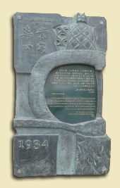
Historic Building Marker – Shanghai-style
This elaborate bronze casting identifies and celebrates a historic building in Shanghai’s Jingan neighborhood. Quite a contrast with the simple rectangular markers seen on historic structures in the US.
No Sign for Stimulus
The Ohio State Senate has passed a measure banning signs that tout federal stimulus spending. Construction signs promoting public realm improvements, and their politician sponsors, are common around the US, but apparently not in Ohio if the federal government is involved.
City Musicscape
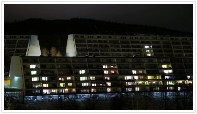
Norwegian director, André Chocron, installed a number of cameras across a small Oslo hamlet, filming the city’s architecture throughout the night until the early dawn. The video captures residents going about their lives, turning lights on and off in their apartments. What makes this video special is the post-production editing… Read more »
Messing up Modern
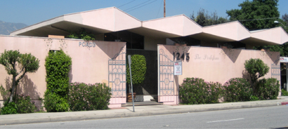
Here’s a dramatic example of Mid-century Modern commercial architecture, but the current owner just doesn’t get it. Degrading the clean lines and spirited design are tacky painted-on Italianate ‘gates.’ Nothing adds old-world charm like spray-painted wrought-iron stencils.
Type on the Go
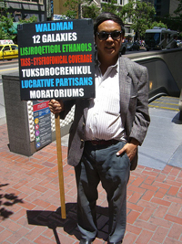
In this era of digital printing and dynamic messaging, the simple picket sign still manages to attract attention and deliver eye-catching content. Made from inexpensive materials, the signs can be produced quickly and scaled to fit any message. The objective is to deliver a message that will not be eclipsed… Read more »
Designer’s Inspiration #1
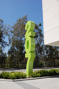
There’s a beautiful sculpture in Glendale CA, not far from Hunt Design. The simple structure is a 24-foot tall, stacked address number, in Helvetica Bold, and painted lime green. There are many address numbers that blur the line between signage and sculpture, but this one stands out because of its… Read more »