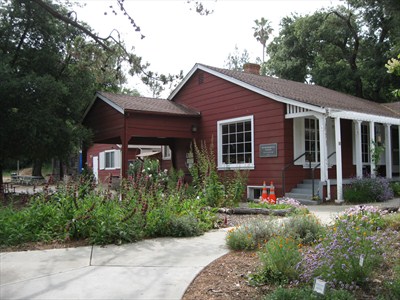
The Silicon Valley city of Cupertino selected Hunt Design to plan and design signage for this rustic 14-acre preserve.

The Silicon Valley city of Cupertino selected Hunt Design to plan and design signage for this rustic 14-acre preserve.

Last month saw the opening of the 35,000 sq.ft. expansion of this venerable Pasadena institution, with new signage and wayfinding by Hunt Design.

NPR’s Markeplace: Wayne Hunt on wayfinding. Listen to broadcast here

See the story from ABC affiliate, Local News 8 here.

California Parks and Recreation Society has selected the Hunt Design project Vasquez Rocks Visitor Center for a 2013 award of Excellence.
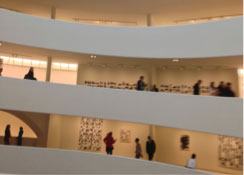
A recent visit to this celebrated New York museum pointed out the near futility of wayfinding in round spaces. Adding to the challenge, the open circular floors are a continuous flowing ramp, so no finite distinction between levels exists. The six levels look identical from every angle so the only… Read more »

You know from the balloons that it’s either a birthday party or a mattress sale. Pasadena boasts four mattress stores in just two blocks — no wonder they are duking it out with illegal sidewalk marketing signs.

We’re not sure what else there is to do in a park. Seen in Hong Kong, these ‘don’t do that’ signs really take the fun out of a park visit. We assume you can still sit on a blanket and read a book.

Ecuador’s capitol city, Quito, has one tough commercial sign code. In the historic central district the only signs allowed are cutout black letters, mounted directly to the wall. No sign panels, frames, backgrounds. No color and certainly no neon or inner-illumination. So, pure expressions of typography are seen everywhere. And,… Read more »
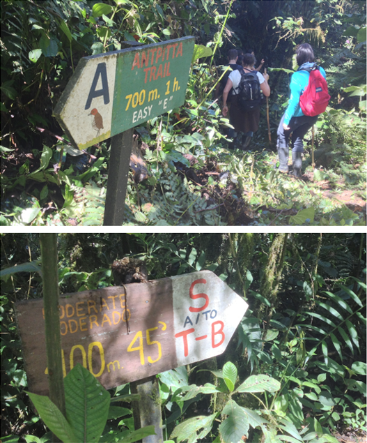
Interesting and effective trail signage in the Cloud Forest high in the Andes in Ecuador. Dealing with the same issues as trails everywhere, these handmade but informative signs show the trail name, destination, hike distance, expected time and difficulty factor. Such information is critical here as the dense rain forest… Read more »