
The National Park Service has selected Hunt Design for consultation and design to improve visitor access and understanding for the Zion Shuttle system. This exciting project marks our seventh assignment for the National Park Service.

The National Park Service has selected Hunt Design for consultation and design to improve visitor access and understanding for the Zion Shuttle system. This exciting project marks our seventh assignment for the National Park Service.

At two hundred forty years old, this famous California mission is the oldest destination yet on the Hunt Design client list.
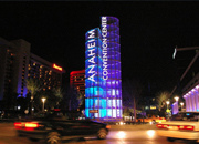
This luminous marquee is the centerpiece of the new Hunt Design sign program at this important meeting center. With RJM Design.
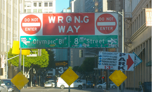
While we frequently point out our favorite signs, we also feel the need to expose the not-so-good. Here, to communicate that Ninth Street becomes one-way east, the City has erected this ungainly traffic control/guide sign right in the middle of the street. Stickers, vandalism and damage don’t help the situation…. Read more »
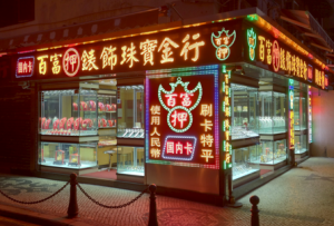
Back in the day, this charming jewelry store would be wrapped in neon. But, alas, LED illumination has taken over nearly everywhere, even here, in Macau, China. Chinese characters that once were expressed in classic single-stroke exposed neon tubes are now drawn with flat soul-less miniature LED units. Yes, such… Read more »
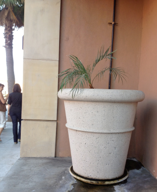
While we like creative plantings in the urban streetscape, a pot should be in scale with its plant. It will be years until this modest palm can hold its own in this huge planter.
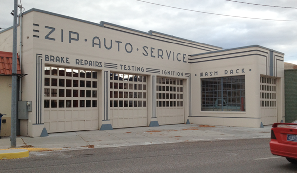
Period typography and decorative lines combine to make this otherwise generic car repair building special. Unlike contemporary applied signage, these elegant ‘cast-in’ letters with ‘paint fill’ color lend both a sense of permanence and purpose. The entire building is a well-composed graphic design. Note how the forms of the E… Read more »
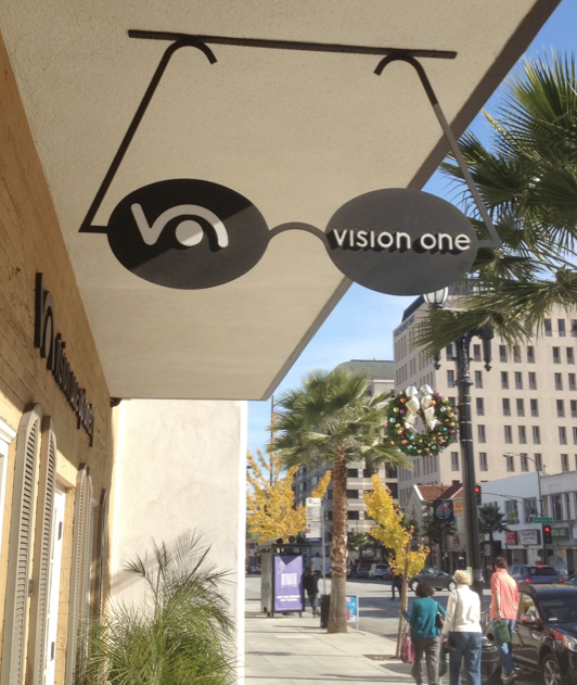
Early merchant signs, especially in Europe, often featured objects or icons hung over the walkway. These ‘picture’ signs had few if any words, depending instead on images of the goods or service being offered to attract customers. The principle still works today as seen in this handsome optometrist sign in… Read more »
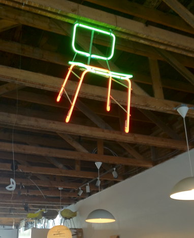
Here’s a neon artist’s interpretation of an Eames chair enlivening the interior of a Mid-century Modern furniture store. Even better, the piece does double duty as a sign – it is clearly visible from outside, inviting shoppers in and categorically identifying the business. The Green Ant, Salt Lake City
Colorful lobby welcomes corporate visitors. Inner lobby displays Auto Club history Historic sign collection forms corridor