It is assumed in the field of wayfinding that people prefer getting information from a person, rather than a sign. The Paris-Orly airport in France is testing that assumption with the use of virtual boarding agents. A two dimensional, life-like image is projected onto an acrylic cut out human form…. Read more »
Category: Blog
First a Sign; then Streetscape Icon; Now Art
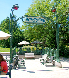
Designed around 1900 by architect Hector Guimard, this art nouveau subway design has been defining Parisian streetscapes ever since – over 80 of these elegant gateways survive. This original example now holds court in the sculpture garden at the National Gallery of Art in Washington, DC, sharing the stage with… Read more »
EGD for…well…the Environment
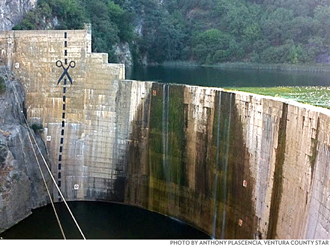
At last, Environmental Graphic Design can live up to its alternate namesake and promote environmental change. Anonymous “artists” stepped up the battle being waged to remove an obsolete and unwanted dam in the Ojai area of California by painting a vast graphic dotted line and scissors icon along the face… Read more »
Garage Sale Wayfinding Program
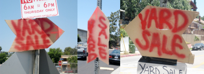
These homemade signs demonstrate many of the principles of effective wayfinding: simple wording, large clear font choice, strong use of color, repetition and consistency of design elements. And shaping each sign as the directional arrow is brilliant.
Blazes – Rustic Wayfinding
Expert backpackers can spot them in the densest of woods: the blazes cut into trees by the original builders of a trail – the trailblazers. Usually a few feet off the ground to be seen above deep snow, these careful cuts into the bark are truly basic wayfinding elements. Look… Read more »
Digitize on the Fly
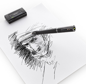
Wacom, the company best known for their tablet and stylus, has developed one of the best “how did we survive without this” technologies to hit the digital illustration and design professions in years. The Inkling (the cute name may be too cute) is a pen and receiver combo that records… Read more »
First News Racks. Now Shipping Drop Boxes.
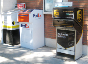
Joining out-of-control newspaper racks on our crowded sidewalks is a new clutter source — branded shipping stations. Usually seen inside office building lobbies, these ungainly and messy-looking drop boxes are popping up in the public way. More unregulated commercial mess on our streets. And, are Fedex, et al paying lease… Read more »
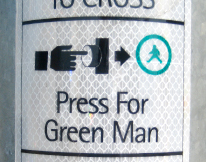
But, what if I want a blue man, or even a purple one?
Low-end Information Kiosk
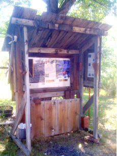
Providing many of the features of a slick big-city or national park kiosk, is this modest homemade information stand seen in rural Oregon. It has a map, destination lists, visuals and explanations of local attractions, a place to post notices – even a trash can. The humble structure embodies many… Read more »
Little Red Mercedes?
We think not. Only a few kinds of cars look good in red – Ferraris, of course, Alfa Romeos, certain older Porsches and small Japanese models. The only American brands that can handle red are Mustangs, Corvettes and maybe Camaros, although we prefer yellow for the Chevy performance car. A… Read more »