Back in the day, this charming jewelry store would be wrapped in neon. But, alas, LED illumination has taken over nearly everywhere, even here, in Macau, China. Chinese characters that once were expressed in classic single-stroke exposed neon tubes are now drawn with flat soul-less miniature LED units. Yes, such… Read more »
Category: Signage
True Architectural Signage
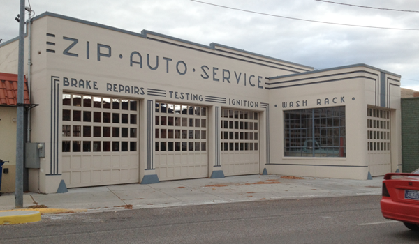
Period typography and decorative lines combine to make this otherwise generic car repair building special. Unlike contemporary applied signage, these elegant ‘cast-in’ letters with ‘paint fill’ color lend both a sense of permanence and purpose. The entire building is a well-composed graphic design. Note how the forms of the E… Read more »
Sign of Furniture – No Words Needed
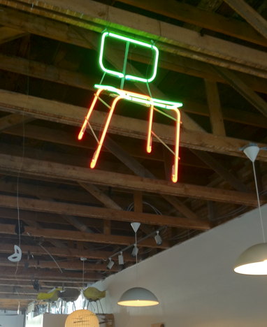
Here’s a neon artist’s interpretation of an Eames chair enlivening the interior of a Mid-century Modern furniture store. Even better, the piece does double duty as a sign – it is clearly visible from outside, inviting shoppers in and categorically identifying the business. The Green Ant, Salt Lake City
Sign for Reading (and Riding)
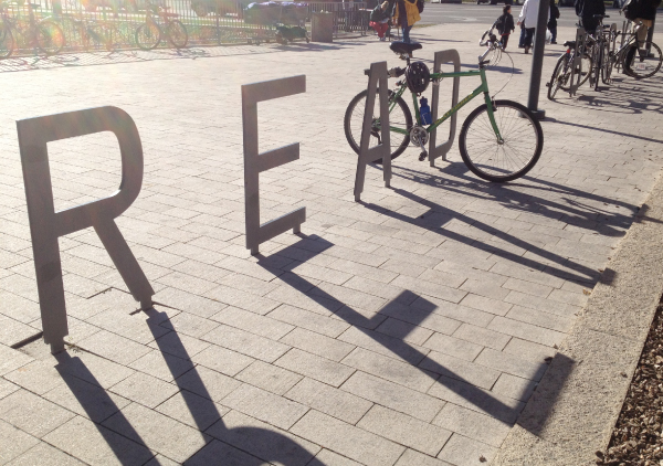
Bike racks come in all shapes and sizes, but this one is a call-to-action sign. The elegant READ BOOKS letters mounted in the plaza at Salt Lake City’s new library not only function as bicycle racks and invite you to read, but also form an engaging civic sculpture.
Enough Signs?
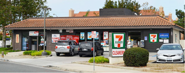
Here’s a 3,000 sq.ft. two-store retail building in exclusive Newport Beach, California. We can’t even count all the signs degrading the humble structure — and the neighborhood. How many of the signs are strictly legal? Probably the freestanding pylon and two or three on the building. Another example of declining… Read more »
Signs of Seasonings
Typefaces have distinct characteristics and when used creatively they can differentiate products and even suggest personality. Here, at a sunny farmer’s market in Pasadena, California, a produce seller employs not only interesting typography, but the additional graphic design elements of borders, pattern and color to make a lively and diverse… Read more »
Old Signs; New Use
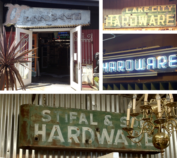
Antique hardware store signs from all over decorate and enhance venerable New York Hardware in Costa Mesa, California. From the exposed neon saw over the entrance to large porcelain enamel pieces inside, the period graphics add interest and character to an otherwise generic interior. And we like the old signs… Read more »
Elegant Wilderness Wayfinding
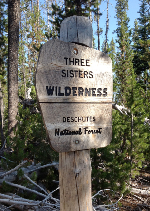
This finely crafted sign greets hikers on a trail to Oregon’s Doris Lake. The beautifully shaped oak panel has been carefully notched into the pine post. Eclectic, but appropriate typography, sand blasted and paint-filled, completes the classic design. A real pleasure to encounter on a hike.
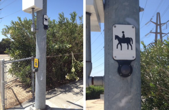
Trot/Don’t Trot
Trashed Signs
Portland’s Alberta Arts District has found a unique way to recycle city signs and add color to the streetscape of one of the city’s oldest neighborhoods.