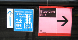
Avoiding ambiguity is an obligation of good wayfinding. These mismatched and haphazard signs not only exhibit a lack of clarity, but also don’t do a lot for the Metro image.

Avoiding ambiguity is an obligation of good wayfinding. These mismatched and haphazard signs not only exhibit a lack of clarity, but also don’t do a lot for the Metro image.
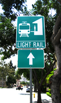
Right out of the government sign manual, this sign is a good example of a failure to communicate effectively. What is light rail anyway? Is there a corresponding sign for heavy rail? Light Rail is an engineering or planning term, usually meant to distinguish aboveground urban commuter trains from belowground… Read more »

On second thought, let’s not.

Creative and profitable re-use of underutilized commercial property is all the rage these days, but seldom do you see examples as literal and successful as this gas station-now-taco stand in Pasadena. The design is smart and minimal – just add tables and colorful umbrellas. Sitting among the gas pumps with… Read more »