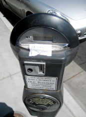
2013, Anytown, USA. Grandpa: You know Timmy, they used have parking meters all over town. Timmy: Gee, Gramps, what are parking meters? Grandpa: Coin collection boxes on steel posts and every parking space had one. There were millions of ‘em. On every block. And each one had a timer to… Read more »
Category: Urban
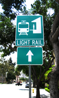
Light Rail? What?
Right out of the government sign manual, this sign is a good example of a failure to communicate effectively. What is light rail anyway? Is there a corresponding sign for heavy rail? Light Rail is an engineering or planning term, usually meant to distinguish aboveground urban commuter trains from belowground… Read more »
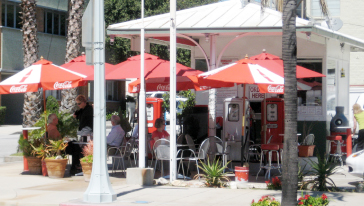
Adaptive Re-use A+
Creative and profitable re-use of underutilized commercial property is all the rage these days, but seldom do you see examples as literal and successful as this gas station-now-taco stand in Pasadena. The design is smart and minimal – just add tables and colorful umbrellas. Sitting among the gas pumps with… Read more »
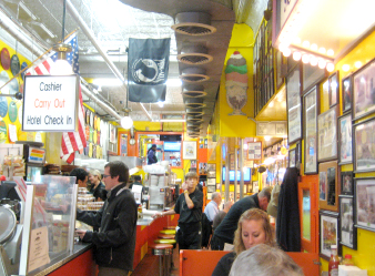
Chuck & Ruth’s Delly
A dozen top theme park art directors could not come up with a place like this beloved and wacky restaurant. Festooned wall to wall and front to back with posters, photos, historic objects, menu suggestions and colorful objects, the ‘delly’ is the Main Street delight of historic Annapolis, Maryland. Tight,… Read more »
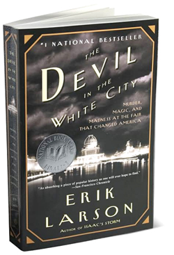
Devil in the White City
Devil in the White City: Murder, Magic, and Madness at the Fair that Changed America By Eric Larson (Crown, 2004) Combining the story of the design and construction of the seminal 1893 Chicago World Exposition with an actual murder mystery of the same era, this page-turner is a must for… Read more »
Public Art? No, Safety Warning.
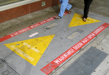
As visually engaging as some public art installations, these super-graphic warnings are seen on sidewalks in downtown Los Angeles. So, while you are enjoying the dramatic graphics, the doors may suddenly open, sending you down into industrial basement purgatory. It’s the ‘old trap door in the sidewalk’ public art gag.
City Practice Versus City Intent
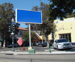
The City of Ventura sign code prevents this local cafe from using an existing signpost and panel to advertise its little shop. Like many cities, Ventura often restricts the size of a sign to be commensurate with the shop it represents. Likely, this sign was built prior to a city code barring… Read more »
No Place for a Flag
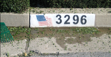
There are a lot of great and appropriate places to display our national flag, but stenciled on a curb is not one of them. The “flag should never touch the ground” concept is pretty much obliterated by the well-meaning, but ignorant companies that will, for a donation, gladly stencil your… Read more »
Sign Spinners
Talk about your animated signs! We often say that a human being is the best directional sign. Here, we get a sign and a person. And we get motion – real human powered animation. Occasionally annoying, but often entertaining. And so far, the sign codes haven’t figured out how to… Read more »
Lining Up for Art
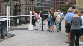
We’ll line up for almost anything, but seldom for art. Here, on New York’s High Line, artist Richard Galpin has ‘em waiting in line to look through his clever stencil-cut panel that aligns architectural features in the background with cut-out forms in the art (foreground).