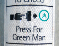
But, what if I want a blue man, or even a purple one?



We know about seeing-eye dogs, but can they read, too?
Organic objects often leave their marks long after nature or decay has taken the originals away. We usually think of fossils as prehistoric, but the process is continuous and, if you look carefully, can be seen everywhere.
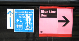
Avoiding ambiguity is an obligation of good wayfinding. These mismatched and haphazard signs not only exhibit a lack of clarity, but also don’t do a lot for the Metro image.
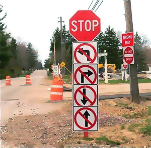
(originally posted to FAILblog.org)
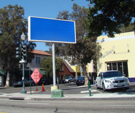
The City of Ventura sign code prevents this local cafe from using an existing signpost and panel to advertise its little shop. Like many cities, Ventura often restricts the size of a sign to be commensurate with the shop it represents. Likely, this sign was built prior to a city code barring… Read more »

Talk about your animated signs! We often say that a human being is the best directional sign. Here, we get a sign and a person. And we get motion – real human powered animation. Occasionally annoying, but often entertaining. And so far, the sign codes haven’t figured out how to… Read more »
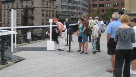
We’ll line up for almost anything, but seldom for art. Here, on New York’s High Line, artist Richard Galpin has ‘em waiting in line to look through his clever stencil-cut panel that aligns architectural features in the background with cut-out forms in the art (foreground).

Small bits of animated color add much to any environment. Color provides depth, definition and drama to otherwise neutral vistas. Color is counterpoint and contrast. Take out color and the resulting monochrome scene is just not the same.