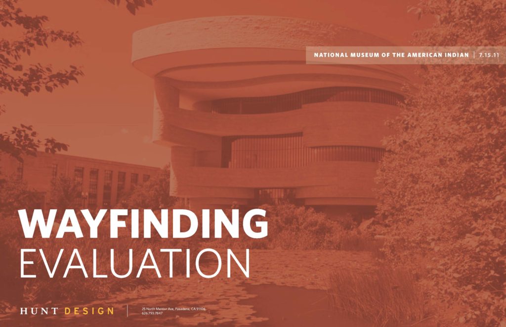
National Museum of the American Indian
Study Purpose
Evaluate all signage and communication relating to the museum’s presence on the National Mall as well as internal circulation and wayfinding.
Study Conclusions
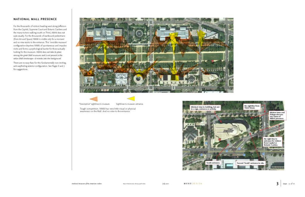
- Museum nearly invisible from National Mall circulation paths
- ‘Doesn’t look like a museum.’ Especially on the Mall
- Entrance location is counterintuitive
- Is not the first, second or even third choice on a Mall visit
- Upon entering, no sense of content or purpose
- Curving floor plans very difficult to navigate
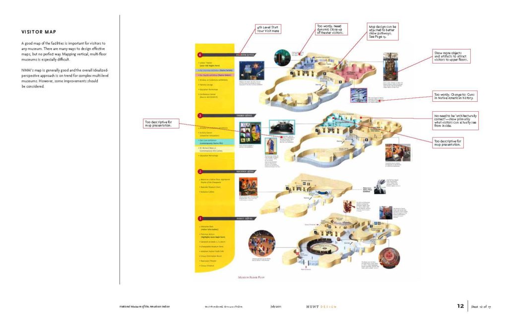
- Hand-out map ineffective
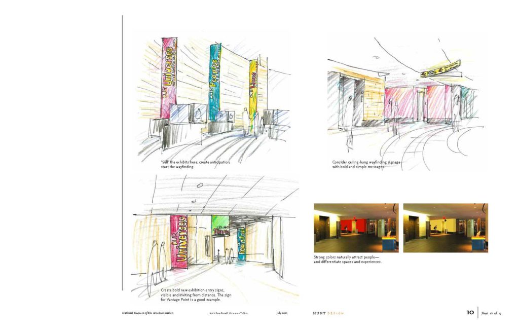
- Major exhibit names too mysterious
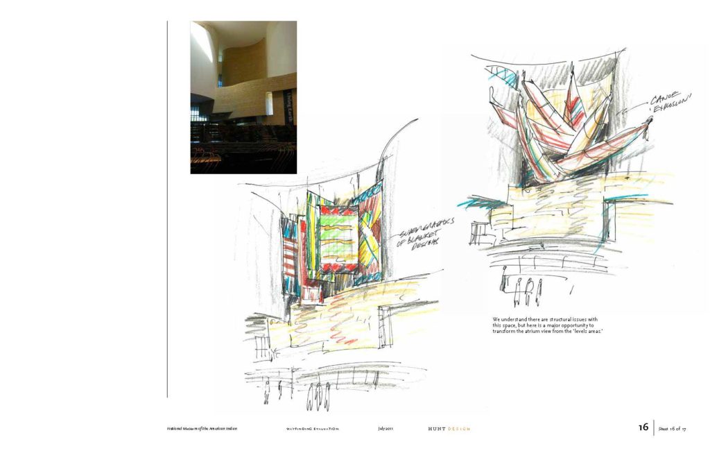
- Top floor not understandable – low visitor count
- Directional signage too small and not well located
Recommendations
- Open up landscaping to better see from Mall
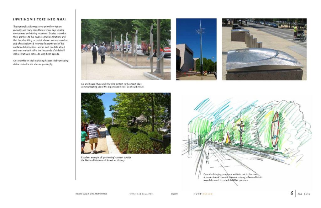
- Add museum icons and objects at exterior to signal content
- Clarify content and purpose at entrance
- Rename exhibits to be more descriptive
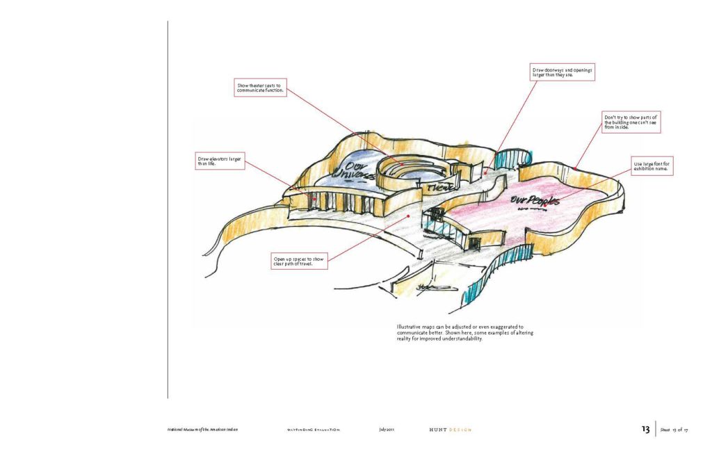
- Create new illustrative map
- ‘Market’ upper floors in elevator cabs
- Deploy wayfinding signage from ceilings


