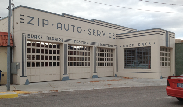
Period typography and decorative lines combine to make this otherwise generic car repair building special. Unlike contemporary applied signage, these elegant ‘cast-in’ letters with ‘paint fill’ color lend both a sense of permanence and purpose. The entire building is a well-composed graphic design. Note how the forms of the E set the size and spacing for the complementary stripes. A real nice addition to the streetscape.
Missoula, Montana

